Table of Contents [hide]
Design is all about making a visual and emotional impact. One of the most effective ways to achieve this is through the use of color. Selecting the right color scheme can give an otherwise plain website a much needed dose of personality. Let’s talk color combinations for websites.
There are a diverse array of styles and examples inspired by various designs, websites, and photography in this post. They may be just the jolt of inspiration you need to finalize the color palette for your next great design.
Understanding Color
Color wields significant influence in website design. It’s akin to a website’s first impression, setting the stage for user perception and interaction. Your brand’s colors are like its signature attire, instantly recognizable. Beyond aesthetics, color stirs emotions and prompts user actions. Blue exudes calm and trust, while red ignites excitement.
But it’s not just about appearances; choosing color combinations for websites is also about ensuring legibility and aiding navigation. Those vibrant buttons that beckon clicks? They’re the site’s interactive candy.
Keep in mind that colors can carry cultural connotations. Consistency in design is like ensuring your website consistently rocks a stylish outfit. So, remember, color is more than eye candy; it’s the essence of your website’s character.
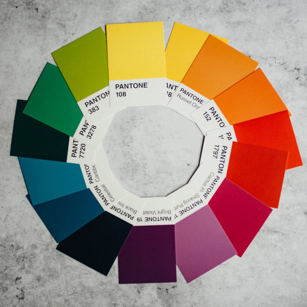
Color Theory
Color theory is the art and science of using color effectively in design. Through it, we can better understand what makes a color combination work. One of the key principles of color theory is contrast. Good color combinations for websites provide enough contrast between the colors to make content legible and images pop. Additionally, harmony is crucial. Harmonious color combinations create a pleasing visual experience.
Contrast and Harmony
Contrast is about ensuring that the text is readable and the design is visually engaging. Dark text on a light background or vice versa is a classic example of contrast that works. Harmony, on the other hand, is about combining colors that are aesthetically pleasing. This can be achieved through:
- Complementary Colors: Colors opposite each other on the color wheel.
- Analogous Colors: Colors next to each other on the wheel.
- Triadic Combinations: Three colors placed equidistant from each other on the color wheel.
Emotional Impact
Colors also have psychological and emotional effects. For instance, blue often conveys trust and professionalism, while red can evoke excitement and energy. Understanding these associations is essential when choosing colors for your website.
My Picks for Great Color Combinations for Websites
With this foundation in mind, let’s get into my list of 17 color combinations that not only look great, but also consider the principles of color theory to create a harmonious and visually appealing design.
1. French Pink and Navy Blue: Retrowave Neon
#ff689b
#146ad7
#feddd4
#ffffff
This neon palette is inspired by the retro 80s aesthetic. If you are looking for something bold, adventurous, and flashy to wow people with for your next design, this is a solid pick to help you along.
2. Pastel Greys: Monochromatic Magnificence
#dad5bf
#afa999
#4d493e
#060405
Photo by The Anatomy of a Web Designer – heartinternet.uk
Going in the opposite direction from the previous pick, here is an understated, monochromatic combination of pastel greys.
Note the color balance and overall usage of colors in the example above. In this case, it’s not about the colors themselves, but how they are being used.
3. Myrtle Green, Off-White, Copper: Vibrant Simplicity
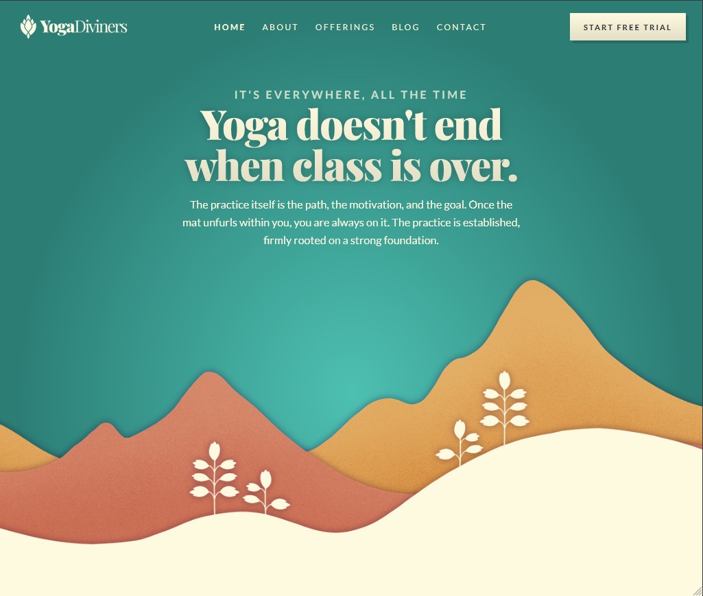
#2C7E75
#3d9f93
#D37F64
#E1A95F
#FEFADF
Website – YogaDiviners
High-contrast colors make up the composition of this color scheme. The green gradient and off-white are the primary colors, with yellow and copper red serving as accent colors.
4. Sandy Orange & Platinum: Warm & Welcoming
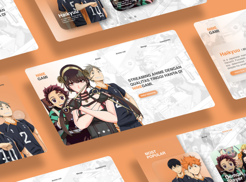
#ffffff
#e3e3e3
#f49f66
#5e423e
#383b4a
Photo by Yusuf Habibi on Dribbble
One of my personal favorites on this list, Yusuf Habibi’s design for an anime streaming website makes great use warm and high-contrast tones. Meanwhile, light grey highlights of ink in the background evoke its manga source material.
5. Cotton Pink, Light Blue, Apple Green: Modern Art
#fcc0d9
#00bae9
#afe3a3
#8f8b8c
Photo by Arno Smit on Unsplash
Inspiration for choosing color combinations for websites can also be found in photography. This expertly composed photograph uses a triadic combination of pastel pink, blue, and green to achieve it’s unique look.
6. Blacks, Greys, and Yellow: Classic Rustic
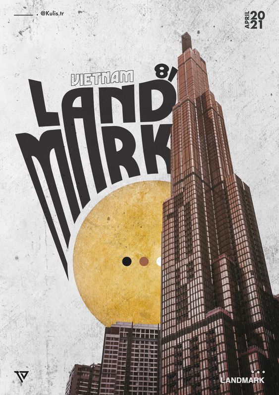
#eeeeee
#e9c06f
#90594a
#373334
Photo by Diệp Nhật Trường ( Kulis ) on Behance
Black and gold is a classic combination. Here, it sits alongside light greys and browns to attain this rustic take on a classic color combo.
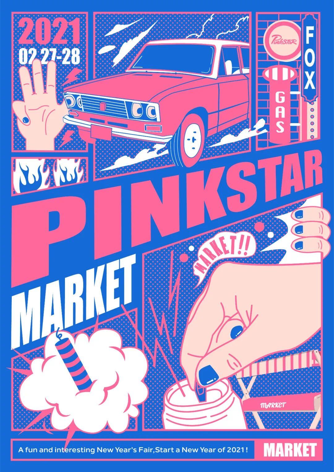
7. Carmine Red & Blue Greens: Bold & Flashy
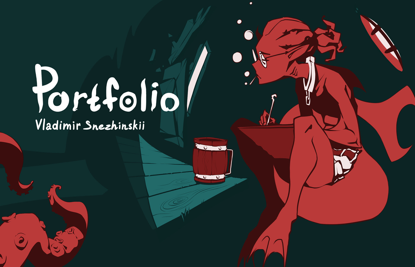
#ba3a39
#0c2424
#216a69
#ffffff
Photo by Vladimir Snezhinskii on Behance
A gorgeous website design that utilizes comic book aesthetics with high-contrast coloration to make a strikingly bold first impression.
8. Light Blue, Ivory, and Coral: Pastel Vacation
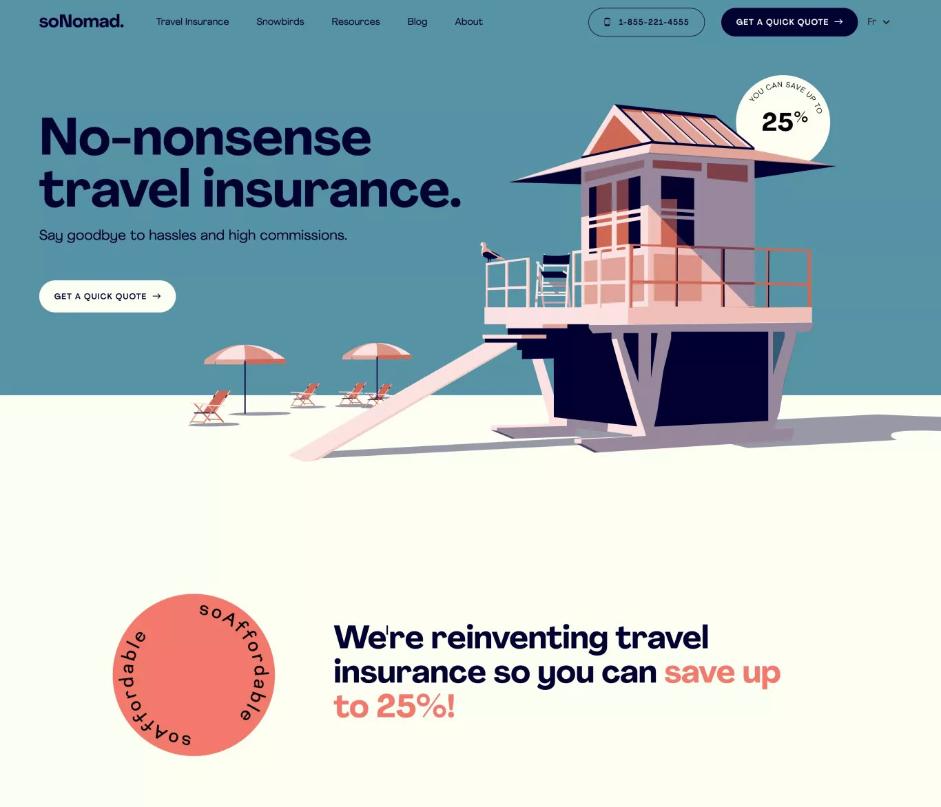
#f4786e
#fce2e1
#fefef2
#5693a5
#01022e
Website – soNomad.
The cool and relaxing pastel color choices of this travel insurance website set it apart and, in my opinion, elevate it beyond the aesthetics you might normally associate with an insurance company.
9. Midnight Blues and Purples: Quiet Moonlight
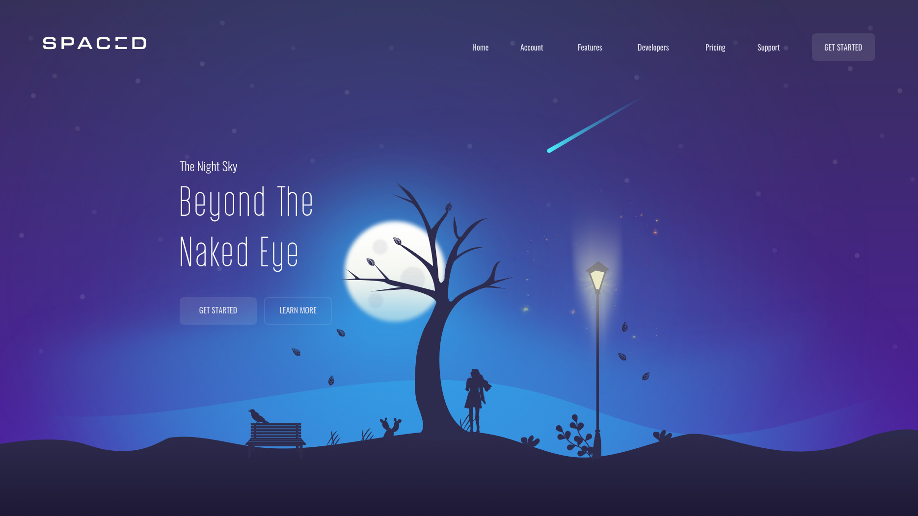
#f9faf5
#3395e0
#403382
#2d2c4e
Photo by Ali Sayed on Dribbble
Midnight blues and purples. Another classic; well-executed using the concept of a moonlit night sky.
10. Mustard & Aqua: Bold-but-Playful
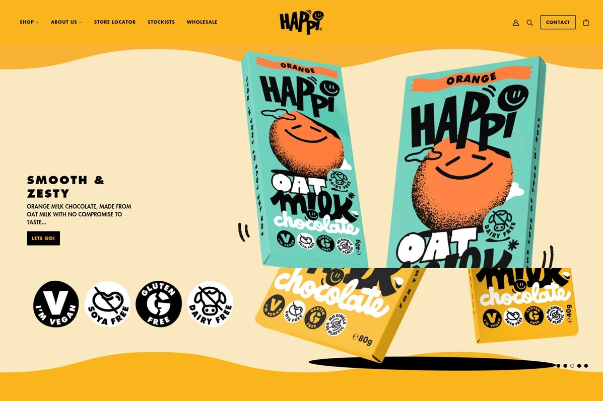
#ffffff
#fae8c0
#fab51c
#72d0be
#000000
Website – HAPPi Choc
If you want subtle, this ain’t it. No, this is a very bold, yet fun example that uses an high contrast colors like aqua blue and a saturated mustard yellow, as well as pure black and white colors with blocky lettering for its text.
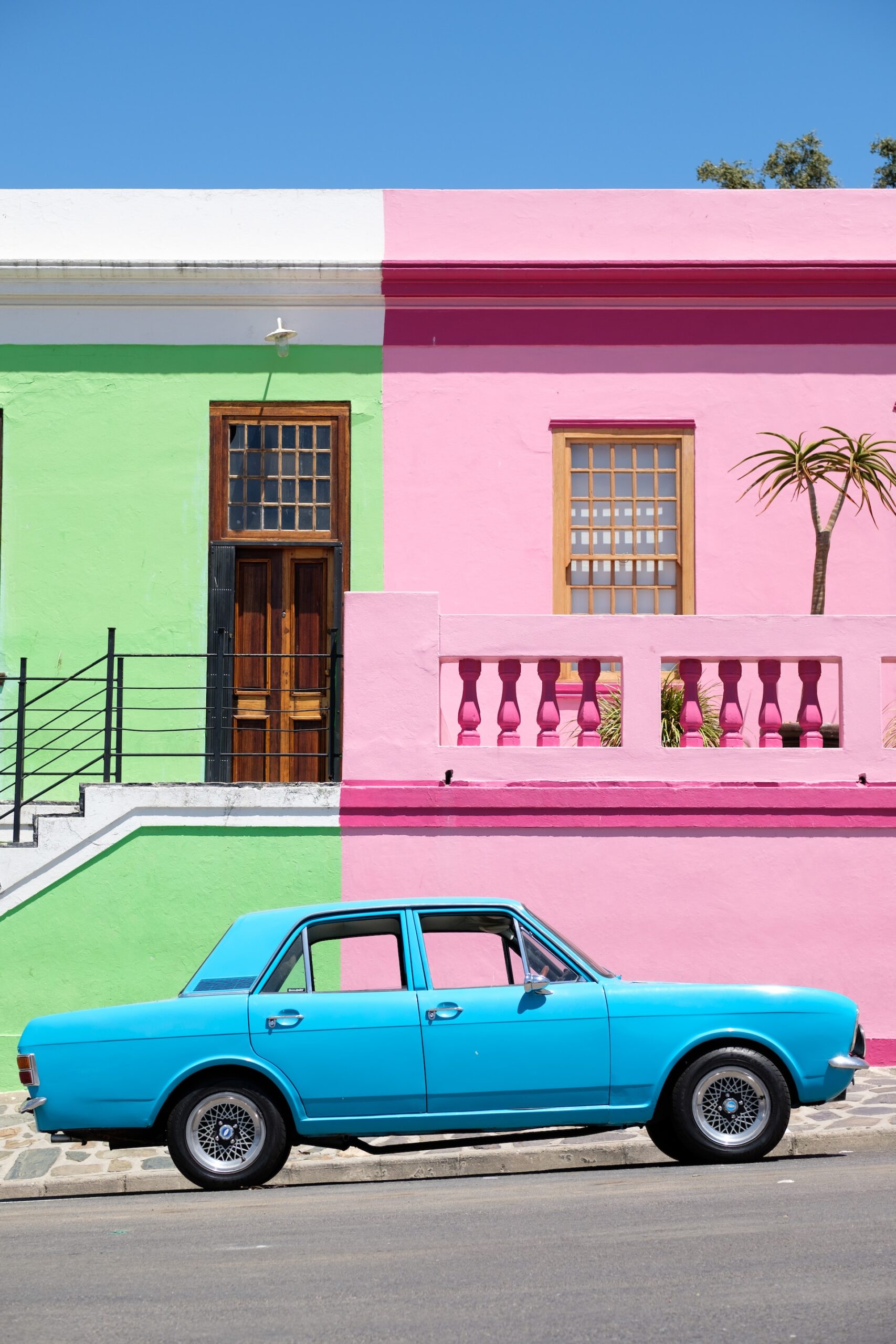
11. Moss & Tan: Woodland Retreat

#85a84d
#052313
#f8f4f3
#daba92
#421e1e
Photo by Parker Hilton on Unsplash
Woodland greens and browns are another classic combination seen throughout the design world, such as in interior design. This example here is inspired by this really nice photo. The white contrasts well with other colors, allowing the van to make a striking impression amidst the backdrop of a dense forest.
Do not be afraid to look beyond digital media to find sources of inspiring color combinations for websites.
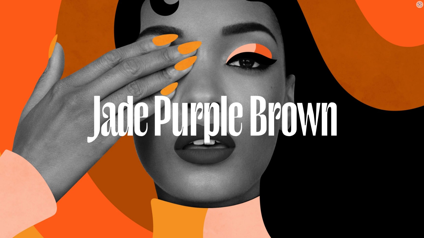
12. Saturated Oranges & Monochrome: Dauntless Class
#fd5a17
#f49020
#fdb294
#ffffff
#848484
#000000
Website – Jade Purple Brown
This palette uses color harmony and contrast expertly. The various oranges compose the first color harmony, which bears stark contrast to the monochromatic shades of grey that sing their own tune.
13. Space Blues & Apricot: Alluring Nocturne
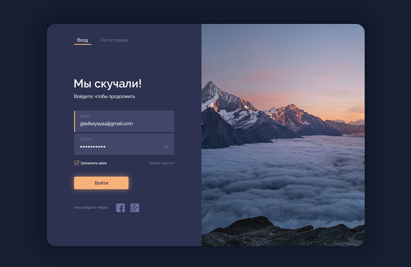
#424669
#2d3250
#141b2d
#f8b179
#fFffff
Photo by Yana Gladkaya on Behance
This example of a login form on a website uses shadows and luminescence to breathe life and light into the nocturnal space blues of the background.
14. White & Sunset Orange: Confidently Smart

#F1EAE8
#F7B6A2
#F06058
#3C3B3F
Photo by Skillcrush, Pinterest
An understated color combination that keeps the contrast and vibrancy relatively low and uses white space to achieve its confidently clean appearance.
15. Space Greys & Arctic Blues: Nord Theme
#ffffff
#eceff4
#88c0d0
#4c566a
#2e3440
Website – Nord (nordtheme.com)
Nord is an easy-on-the-eyes arctic color theme made by a German studio. It encapsulates styles for both light and dark modes.
Nord theme is available as a custom theme for many developer-oriented tools, although the possibilities of this color palette are by no means limited to coding.
16. Desert & Monochrome: Cozy Chic
#ffffff
#e6cdb9
#000000
Photo by Suvi Anne Maria on Behance
This design keeps it simple with primarily light colors such as pure white and a sandy yellow, along with black text, making it one of the most straightforward color combinations for websites on this list.
17. Deep Blue and Infra Red: Vivid Contrast
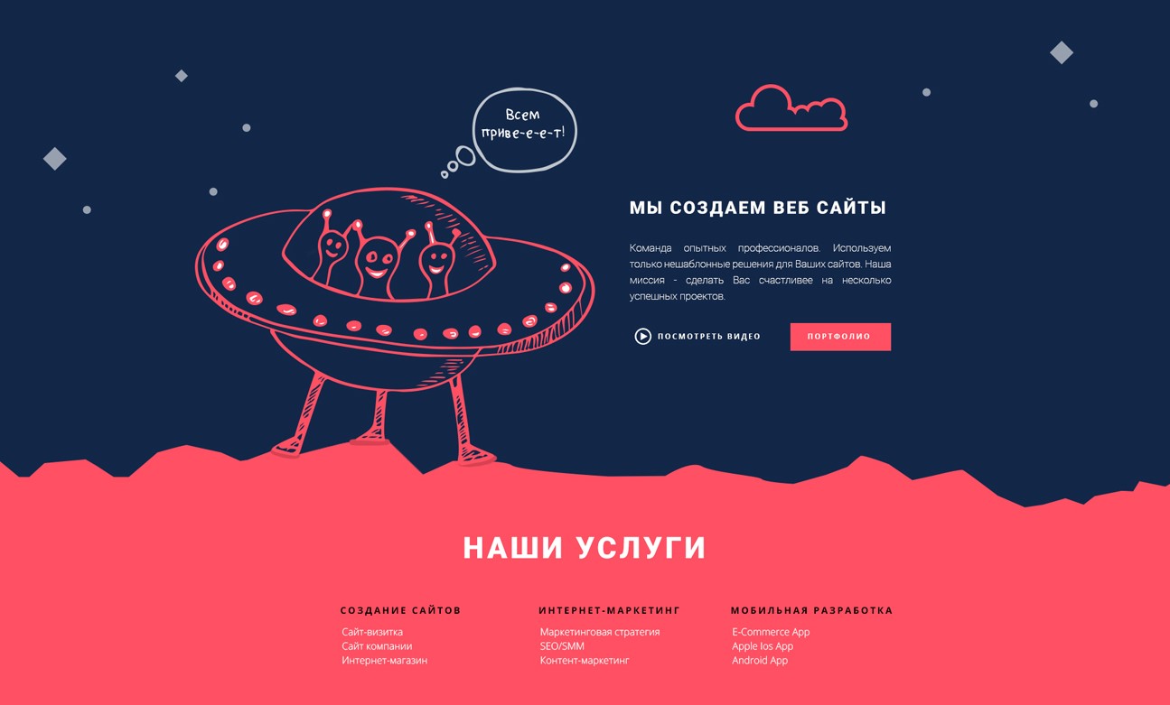
#122647
#ff5064
#ffffff
Photo by Antonina Komnatnaya on Behance
Red and blue are perfectly balanced against one another in this vibrant color scheme. The contrast of the colors and the playful shapes give it a fun and interesting aesthetic.
Closing Thoughts
That’s it. That’s the whole list.
Your website’s color scheme is a vital part of your digital identity. The right combination can evoke emotions and influence user actions.
These color combinations for websites offer a palette of options to inspire you in making your website visually stunning. So, explore, experiment, and find the perfect color combo that represents your brand and engages your visitors.
To discover even more color schemes, I recommend that you test-drive some of these colors in a design playground. Try changing one or two colors in a palette and see how it affects the whole look. Recall the concepts of color theory we discussed at the beginning of this article.
Color combinations are one of the most impactful decisions to make in a design project. It is my hope that with this list, you will feel a little better equipped to take on that challenge.
Leave a Reply